
The next role I found myself in was as a Designer for the Game Engagement Management (GEM) team under the Slots/Match 3 org. They had cobbled together their own team of designers to tend specifically to Slots and Match 3 players, as this group of players were highly active with our social media pages and additional content was needed to keep engagement high. After about a year in this role I was made Design Lead and from there, went on to build a world class design team that spanned from San Francisco, CA, Austin, TX, Chicago, IL all the way to Bangalore, India.
Though I no longer took on design tasks, I was still very hands on and had my finger on the pulse of the daily goings-on of our team which was 12 people strong, directing the team to create assets that were timely and on brand. I often went in to correct work or make revisions in others' absences. I had developed extensive hiring, onboarding, and training documentation which was added to our intraweb wiki for others to follow as needed. Along with the help of our producers, I also streamlined a nice workflow for our team, so our work had plenty of eyes reviewing it and nothing got lost in the process. Because we worked closely with many important licensors it was imperative that we tracked all assets to ensure timely feedback and corrections. We relied heavily on JIRA as a ticketing system for our work to help keep order and oversee fair distribution of work. JIRA ticket triage and feedback were a major component of this role as it involved keeping a team of 12 the was turning out thousands of original pieces of content every month for a variety of games organized.
Art Direction
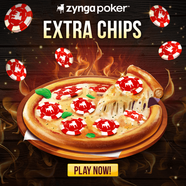
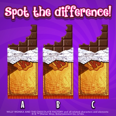
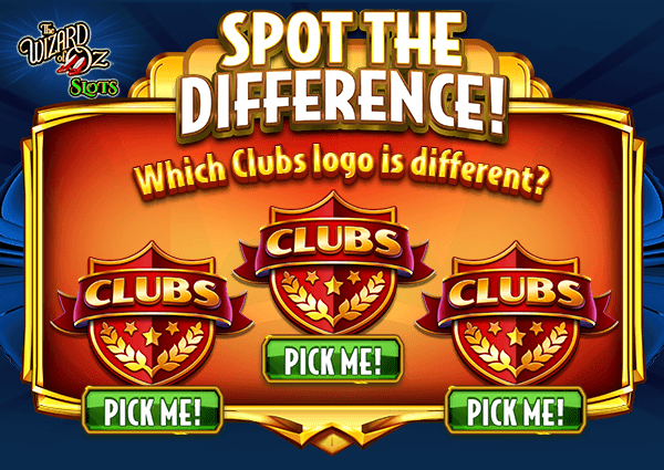
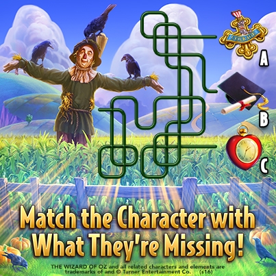
My main duty as the lead of Game Engagement Management (GEM) Creative was art direction. Ensuring consistency, clarity, and overall quality was my primary objective, in terms of art execution. This included confirming that messaging and imagery are both on brand and met Zynga and licensor standards and guidelines. I was required to make recommendations on appropriate art assets, treatments, layout, and composition and often needed to assist designers in case they struggled with application of these concepts. In this role it was crucial that I performed not only as a manager but also as practitioner of design, jumping in and getting my hands dirty when the task called for it.

Ticket Triaging
Related to Art Direction since Production and I used these sessions to sync on the status of work requests, to discuss additional art needs or blockers, and to be provided updates on new art approvals and revised processes. These meetings called for me to be very knowledgeable about the work my team was doing as well as their individual contributions. Ticketing through JIRA helped keep our priorities in order and reviewing ticket status prevented anything from slipping through the cracks. We discovered that too many out-of-date assets were finding their way into marketing art, so we also used these meetings to keep our repository up-to-date with the latest approved art, ensuring that requests were getting the best art recommendations based on the content specified. Ultimately, these meetings eliminated unnecessary back and forth between teams thereby reducing feedback loops for an, overall, more streamlined process.
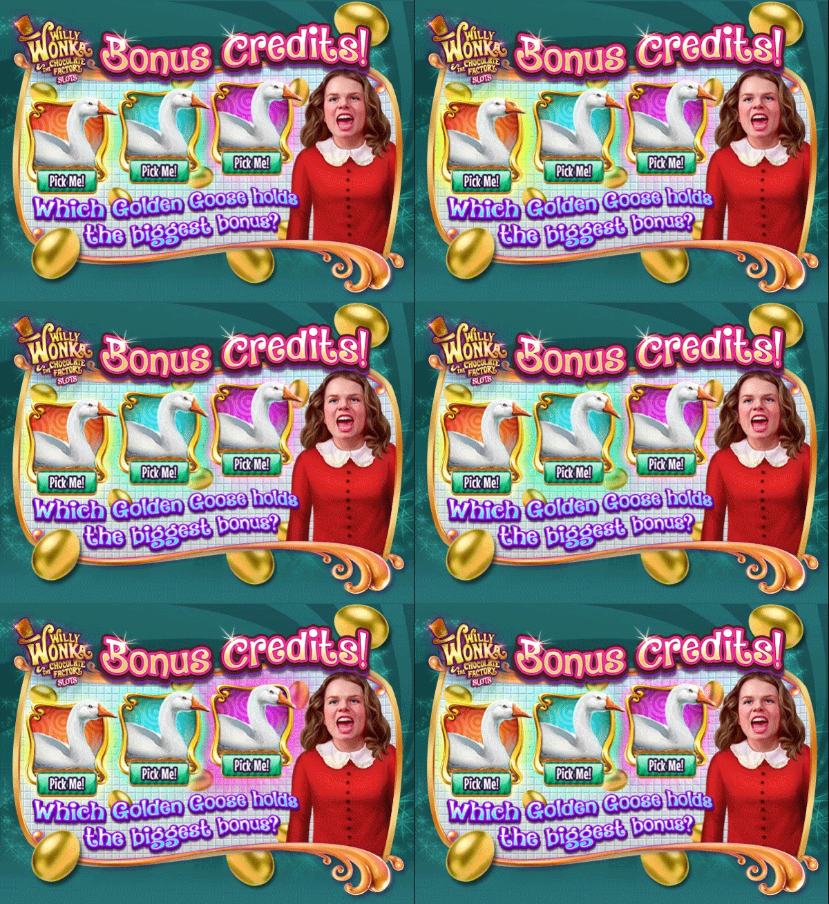
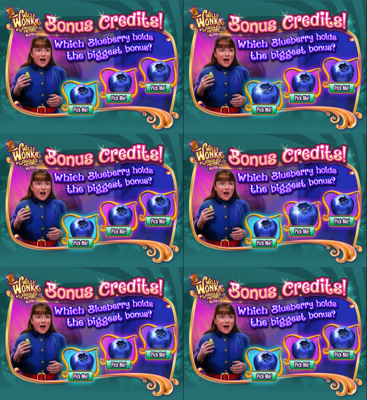
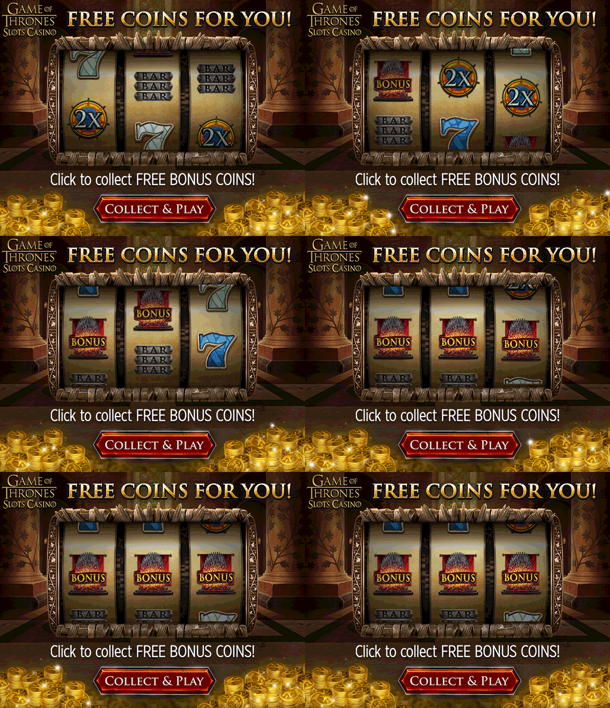
Feedback
A major provision of this role required that I understand and familiarize myself with all titles we supported, their licensor restrictions, their varied audiences, and what appeals to them. I was responsible for more than just the aesthetic of the design, I needed to be able to speak to the content and whether it addressed the concept as laid out by the requestor. I was the only designer on the team providing feedback on Concept Art/Illustration work, having some familiarity with employed methods, techniques, and composition. Sometimes it was also necessary to present feedback back to the channel owners and PMMs as well, usually when their ideas or requests weren't making sense with the art available. In this case, we might put in a special request for the concept artists to customize art for our use.
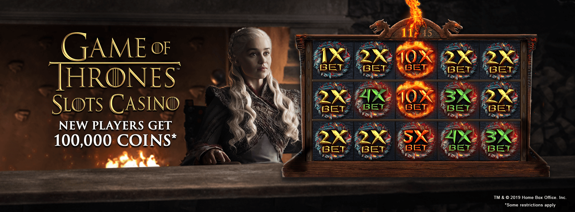
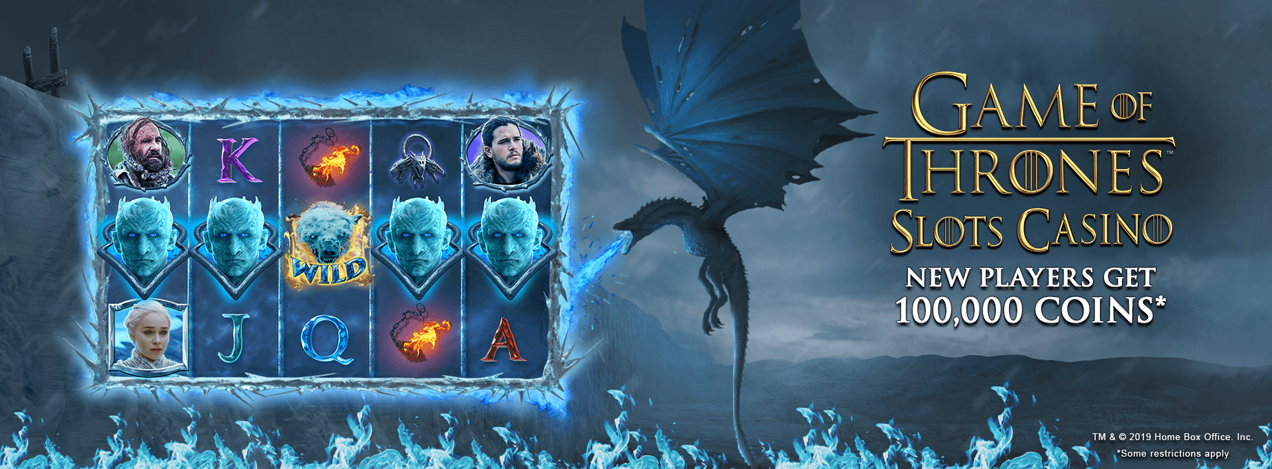
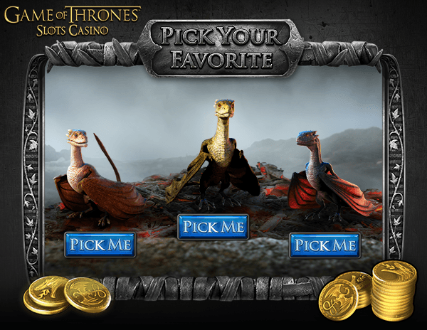
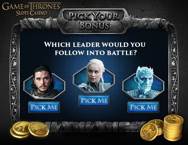
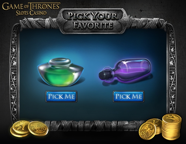
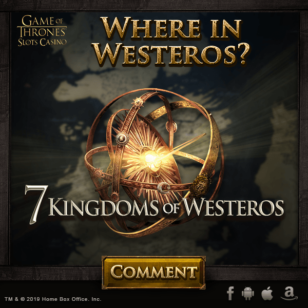
Game of Thrones Slots Casino
1 / 4
Troubleshooting & Spec
One of the more important aspects of this role, to ensure the team was still designing assets for various channels effectively, was to occasionally check platform specs and against our art then, updating or revising our templates as necessary. Platforms like Facebook and Instagram regularly change multiple design specs within their UI that creates different results for desktop and mobile viewers. It is important to account for safe spaces, dimension changes, and even light/dark mode preferences. To test how assets are appearing prior to posting our page, our Production team set up multiple test pages through our most commonly used social channels to view changes without pushing them out to all our fans.
Staying on top of partner rebrands, and ensuring we were using their latest logo marks was important as well. The latest rebrand that impacted our work was when Facebook rolled out a new logo. Because we marketed so heavily on Facebook, it stands to reason we should be using the logos they're pushing, in the exact manner that they've laid out in their guidelines—expected behavior in a strong partner relationship. My role required checking through all social media web asset pages quarterly to ensure we were on top of any major changes.
Documentation
The Best Practices guidelines was ongoing project and a coordinated effort between the GEM Outsource Manager and myself. The intent was to create a series of specs, expectations, and directives around the handling of our artwork, for onboarding and for general information purposes. This would provide our vendors some insight into our team practices and methodologies, that way they were able to tend to our work while maintaining a certain level of continuity in terms of quality, clarity, and efficiency. Because we worked so remotely from our vendor, this also took a lot of the guesswork out of their day-to-day tasks so no production time was lost trying to work out common details. Ultimately, the goal was to provide our vendor with a digital file of these guidelines and a 2-day training session with the Outsource Manager to clarify all the material. Due to COVID, creating a video training session was discussed as an alternative to meeting in-person.
Style Guides were another joint documentation effort with User Acquisition and the game teams, with the aim of cataloging the design and art details specific to our promotion of a given game, which should somewhat mirror the in-game elements for consistency and continuity. It was important to capture where these design techniques diverge and explain the reason for the departure. Layout, Palettes, Headers, typefaces and CTAs were all chronicled for future in-house and outsource designers to reference in order to create aesthetically seamless artwork and ads, regardless of who was working on them.
Templatization & Localization
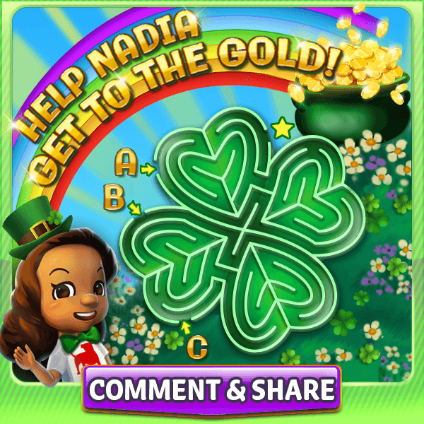
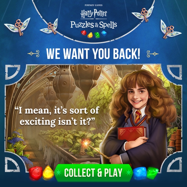
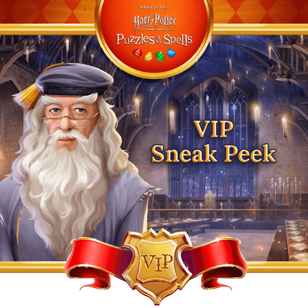
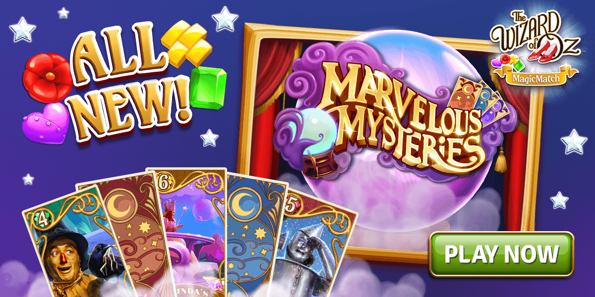
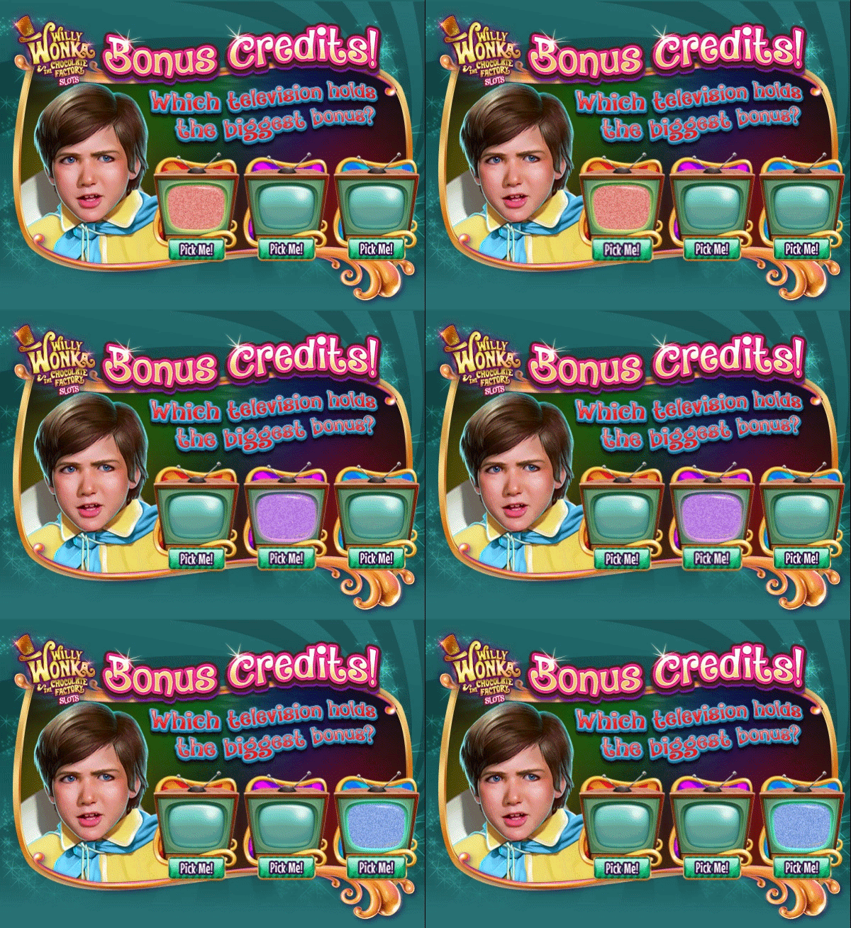
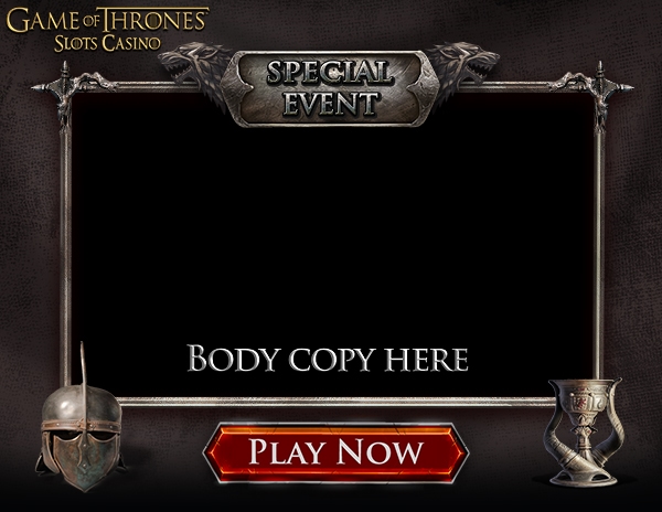
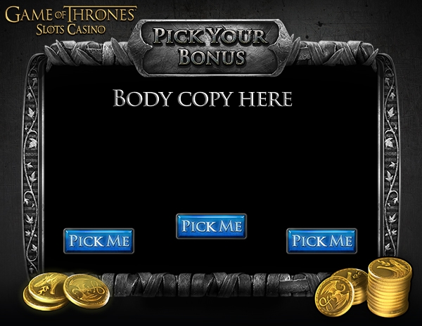
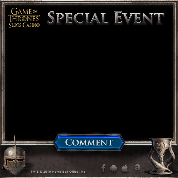
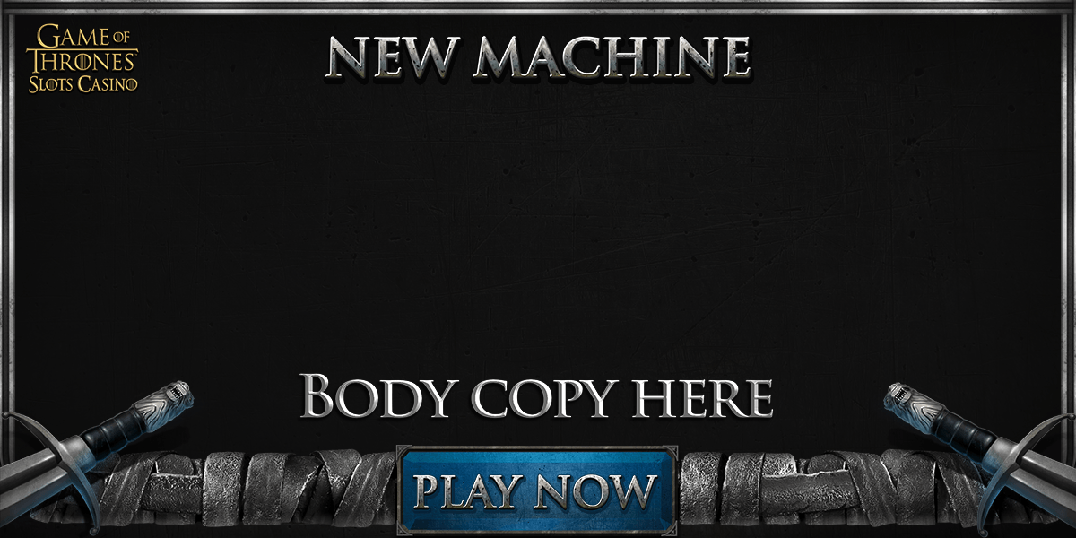
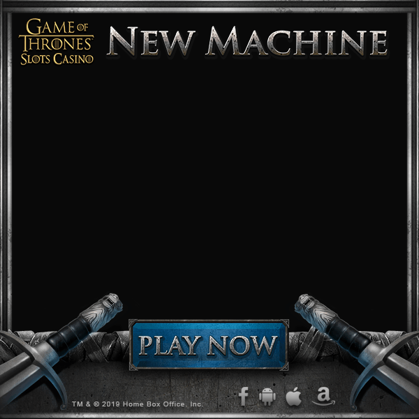
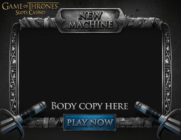
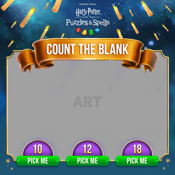
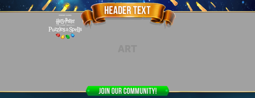
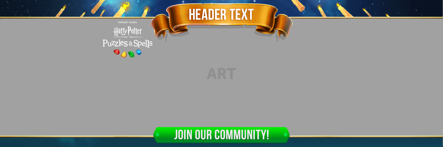
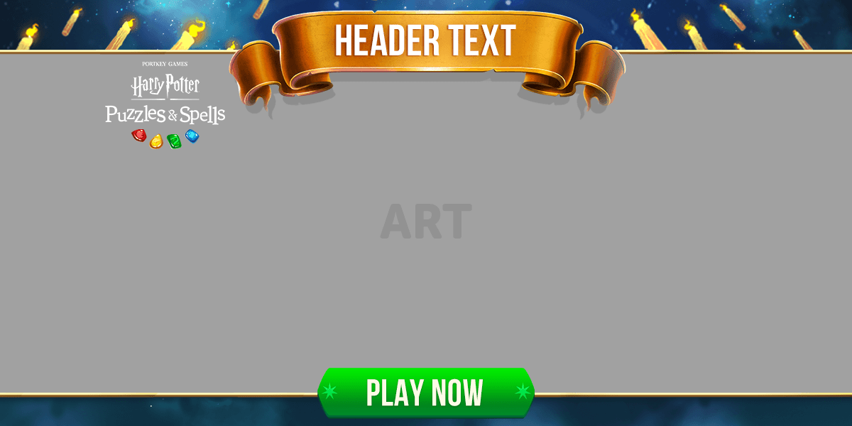
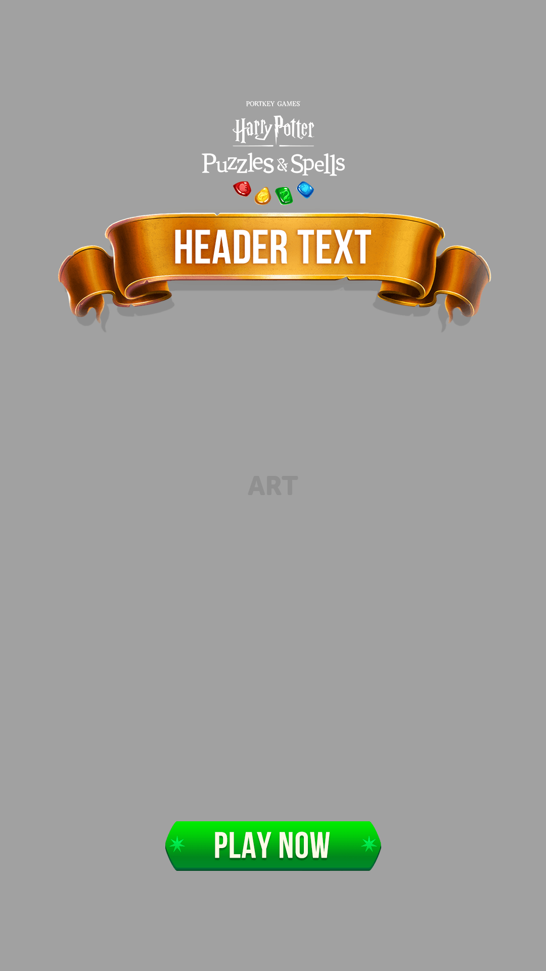
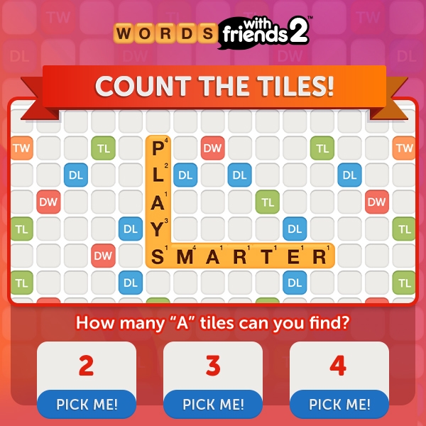
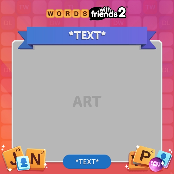
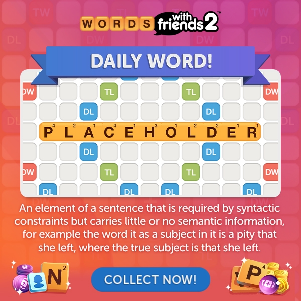
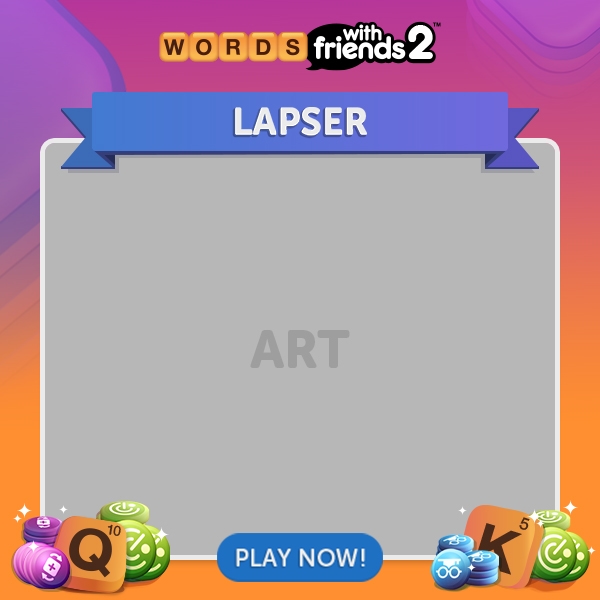
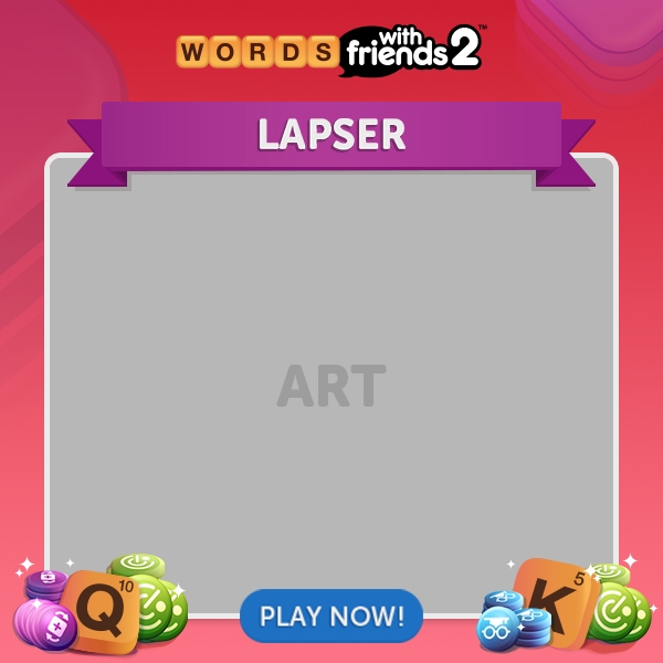
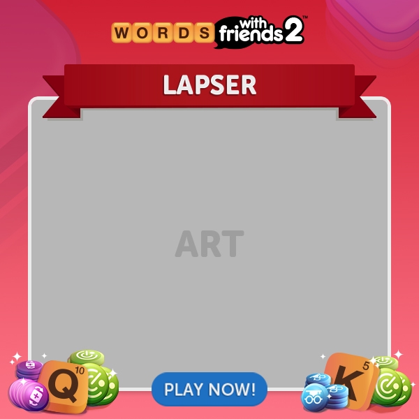
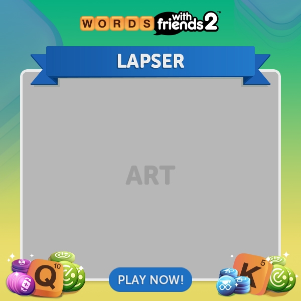
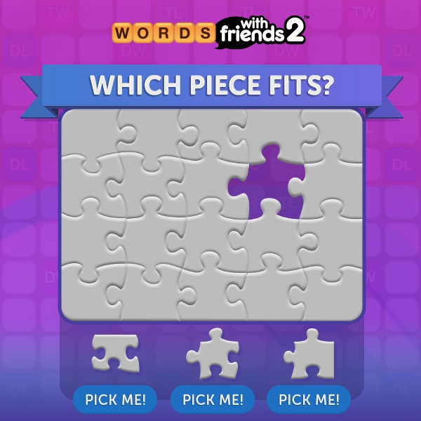
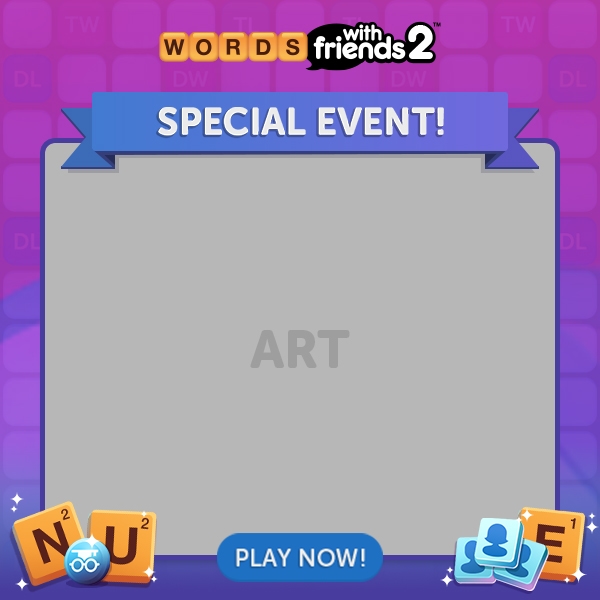
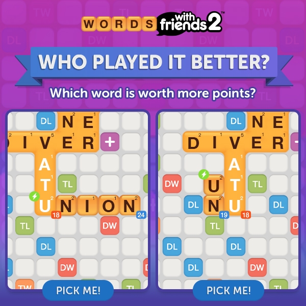
A major task related to game launches was the templatization of ads. Template creation was used to push branding while organizing and standardizing recurring promotional information like logos, headers, and CTAs. Safe spaces needed to be accounted for so that clipping of content wouldn't occur when viewing between web and mobile devices. Further, our team would try to use various templates and palettes to create a visual language to differentiate between the types of information we're advertising, for example, Regular Players vs. VIPs, New Machines vs. New Events, Incentivized Content, etc. Once the design of these templates were settled, we updated and automated them to handle localization for languages like FIGS and APAC in order to run them for international audiences.
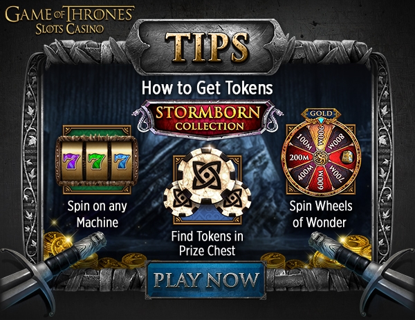
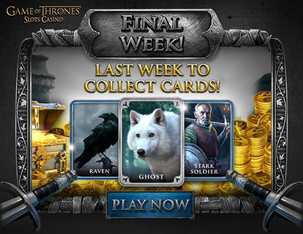
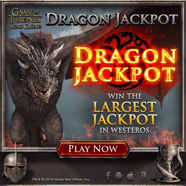
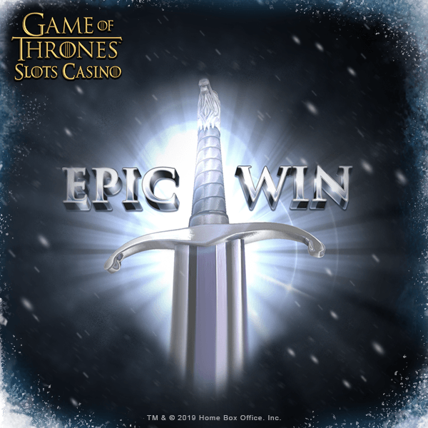
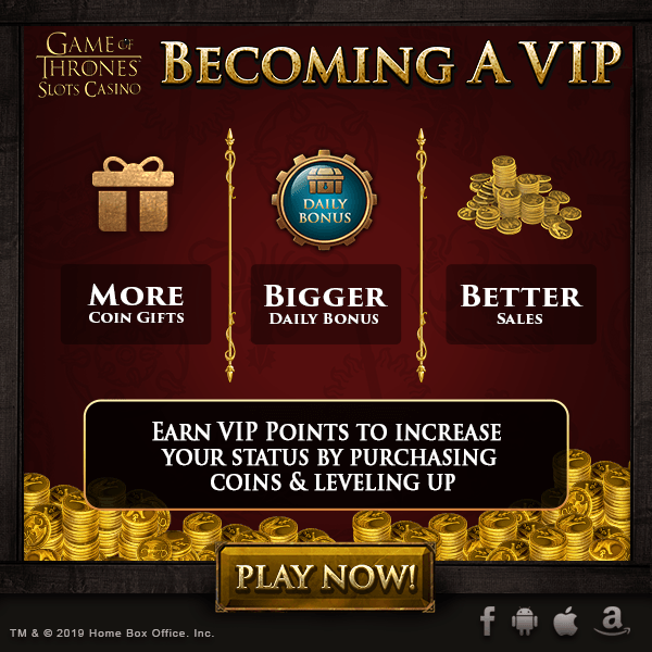
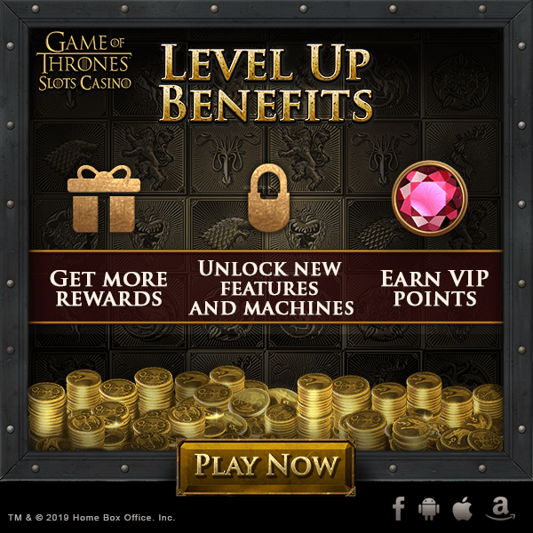
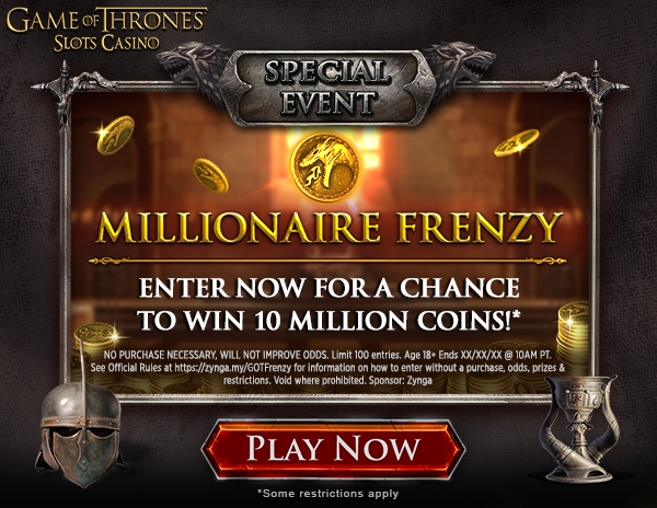
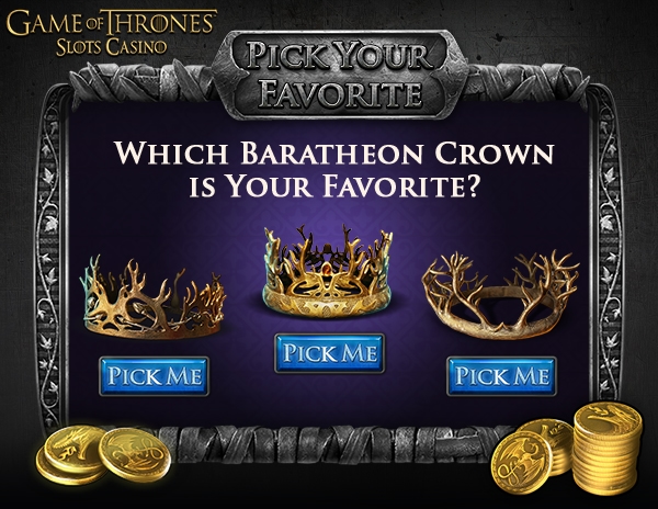
Game of Thrones Slots Casino templates

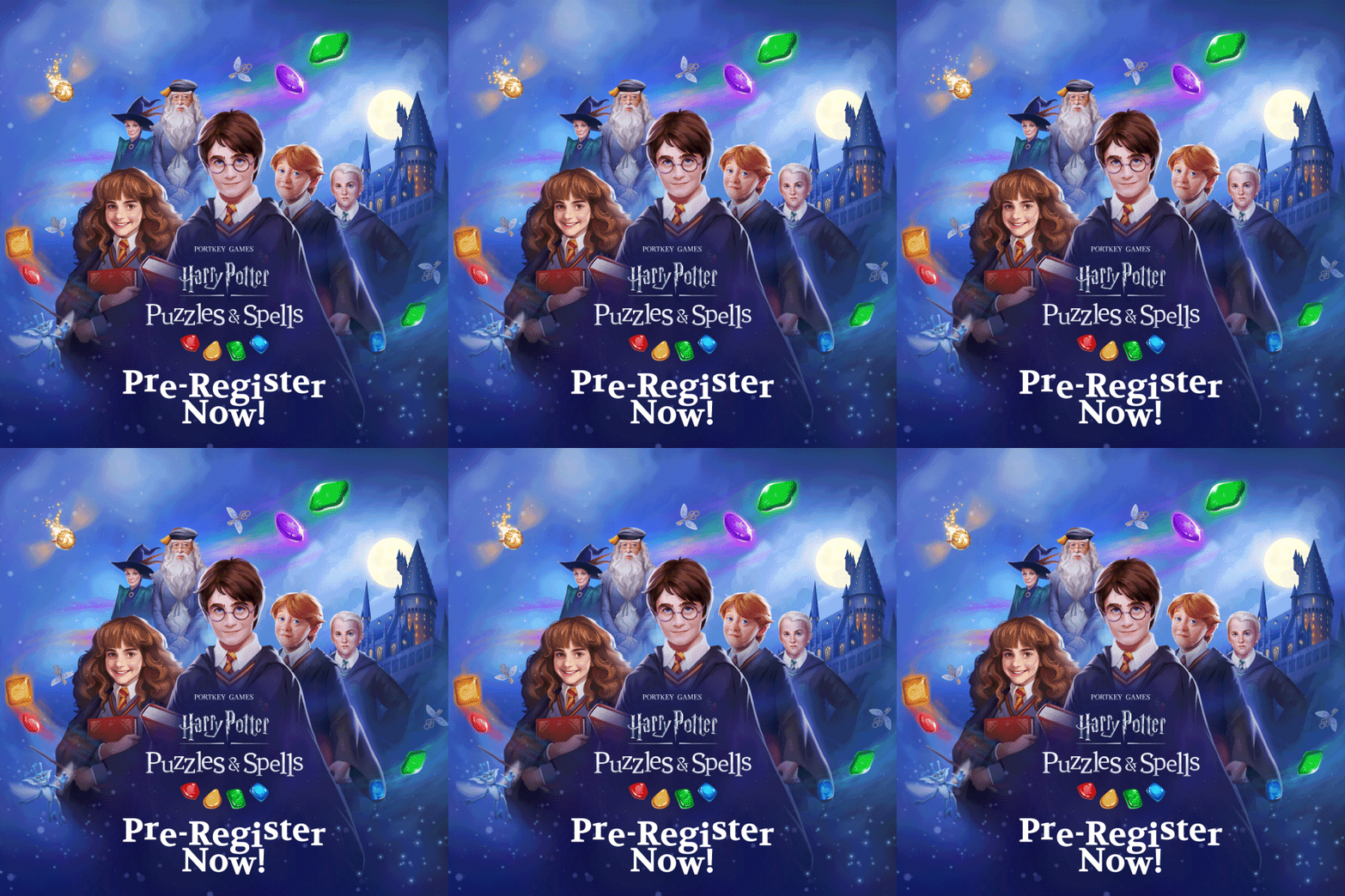
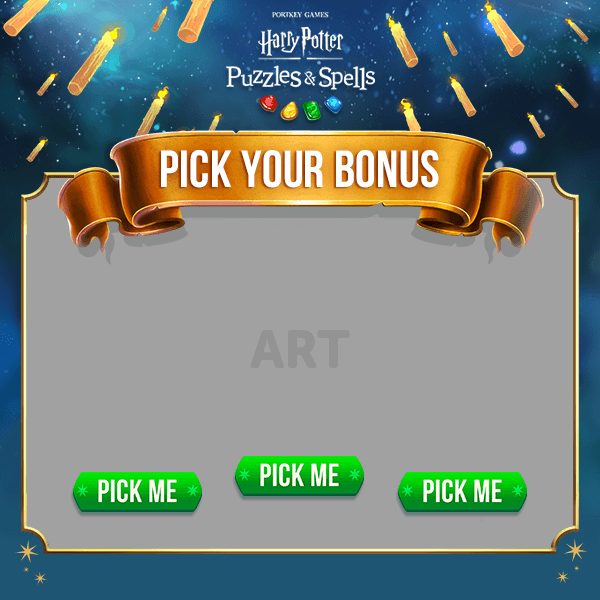
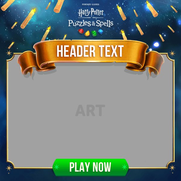
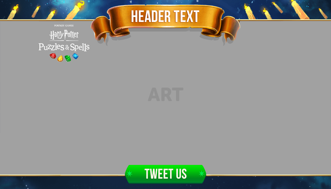
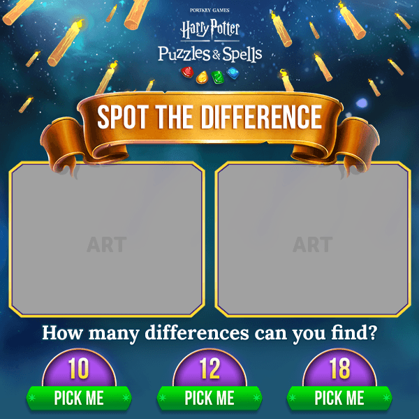
Harry Potter Puzzles & Spells templates

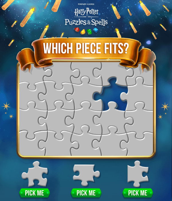
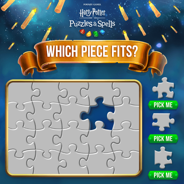
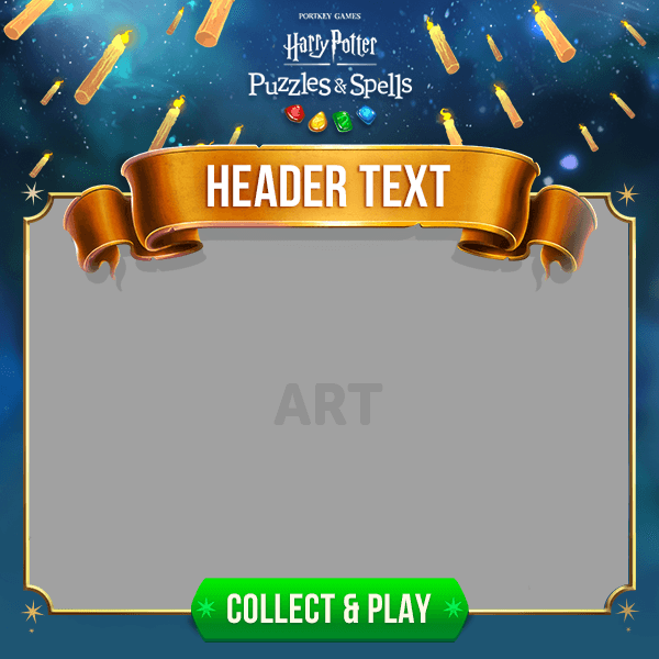
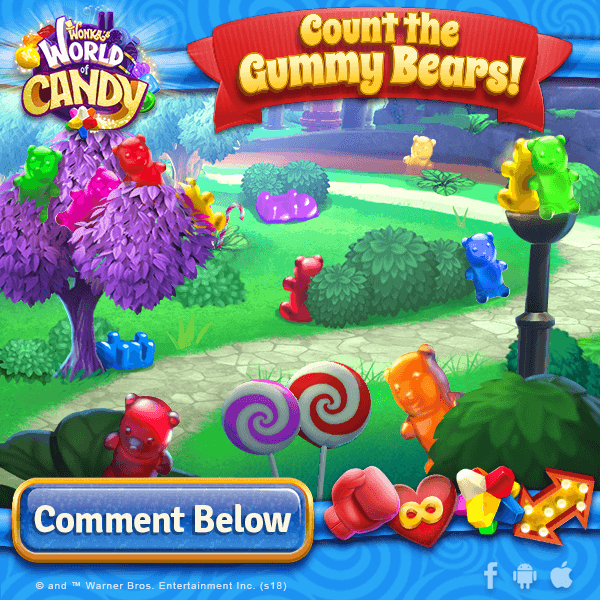
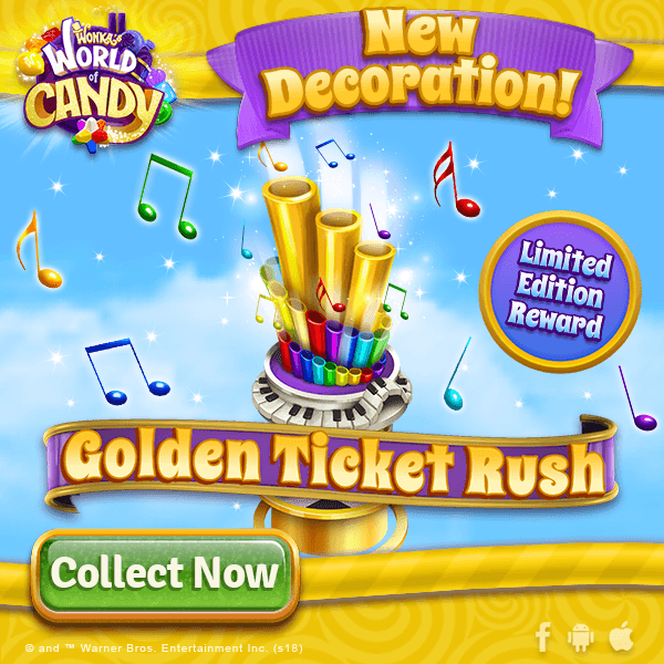
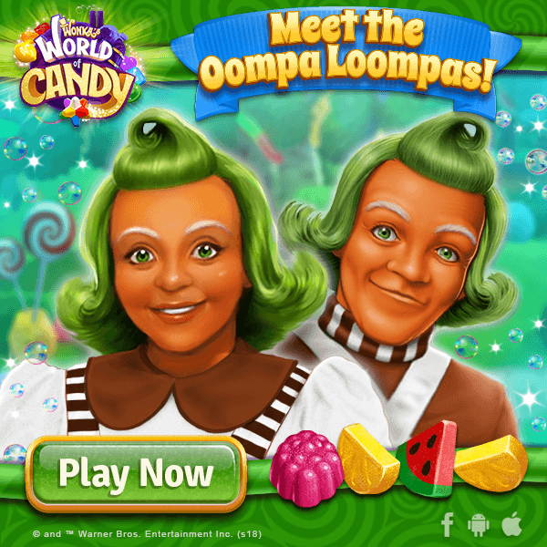
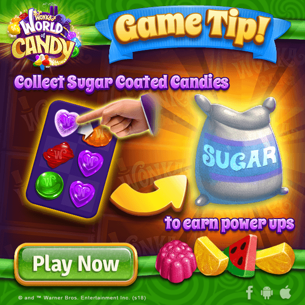
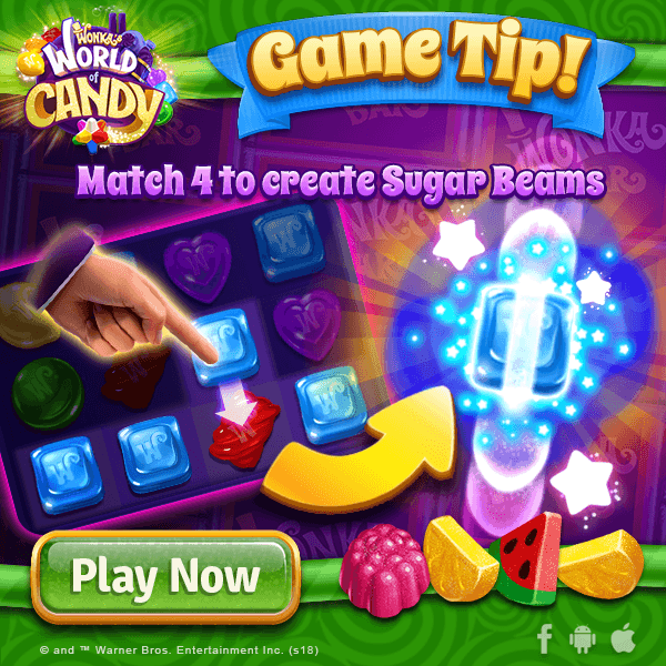
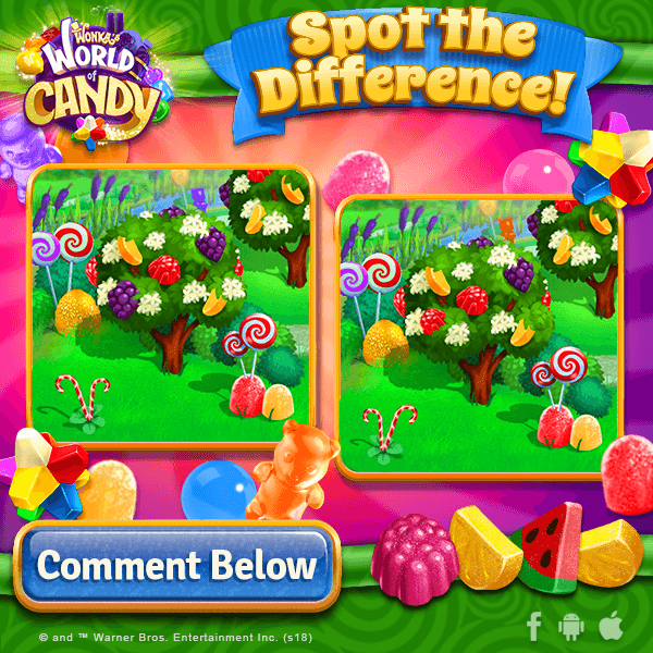
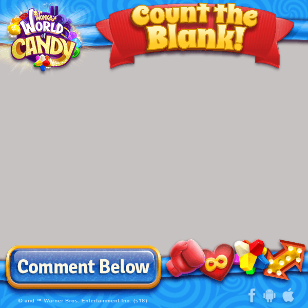
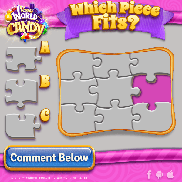
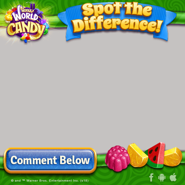
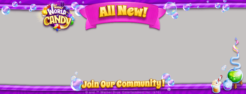
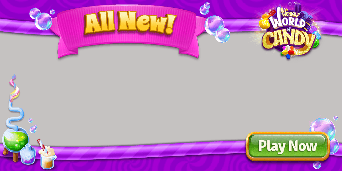
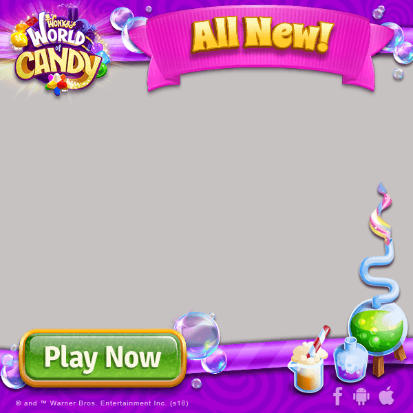
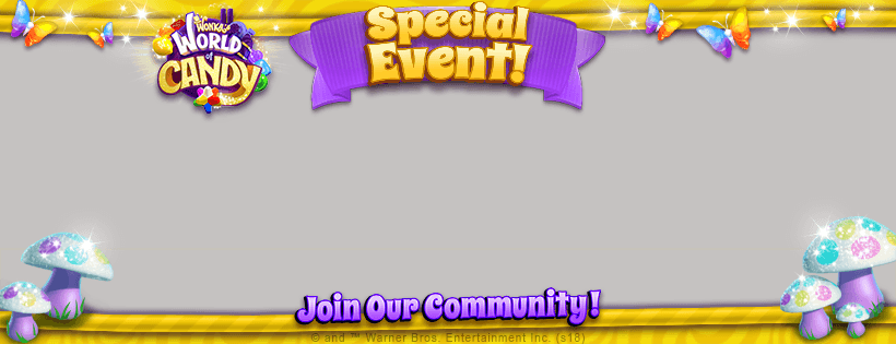
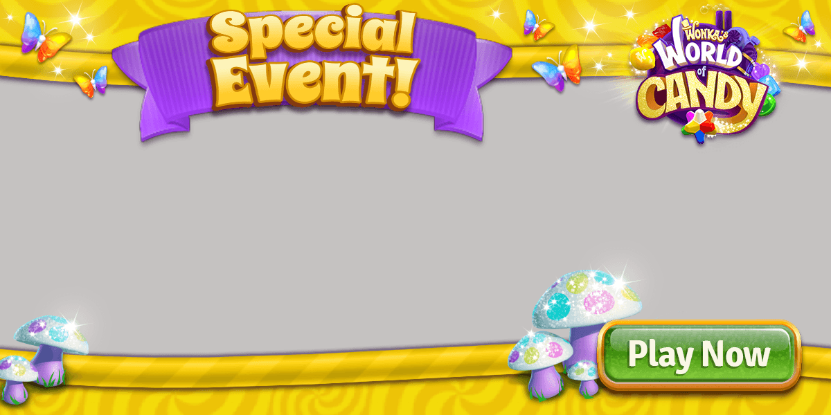
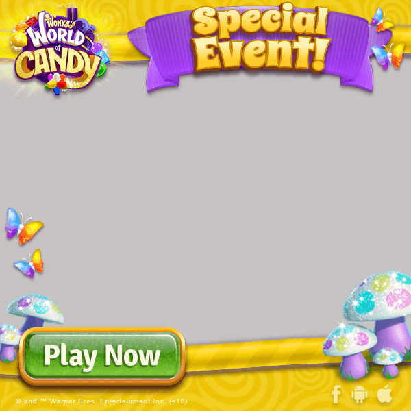
Wonka's World of Candy templates
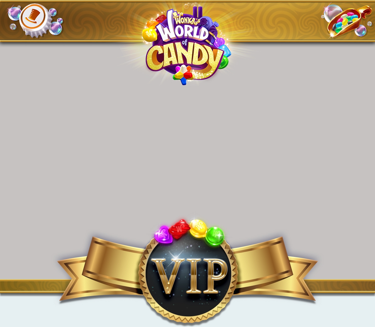


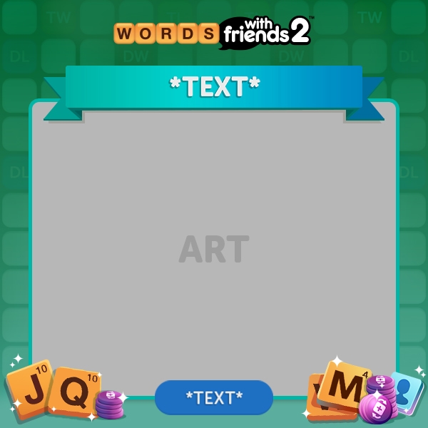
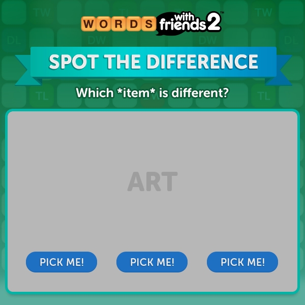
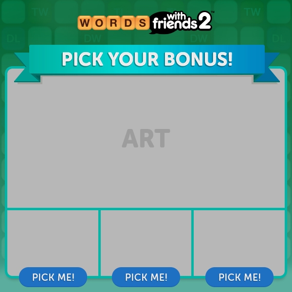
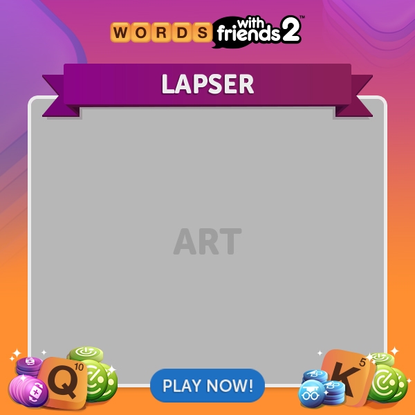
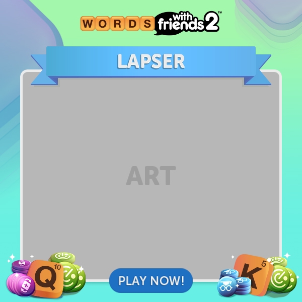
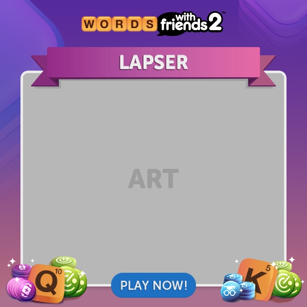
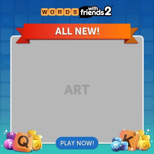
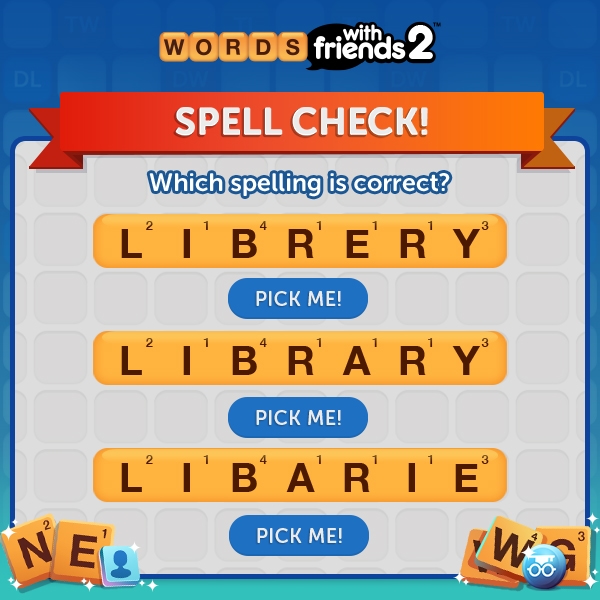
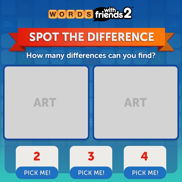
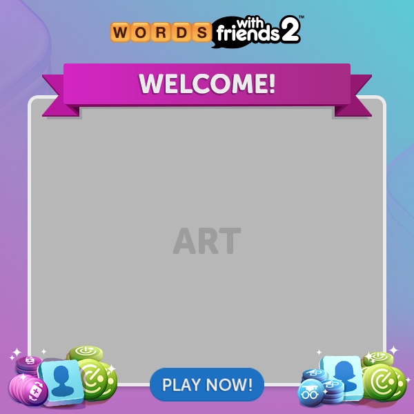
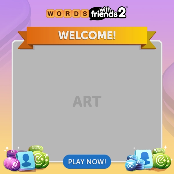
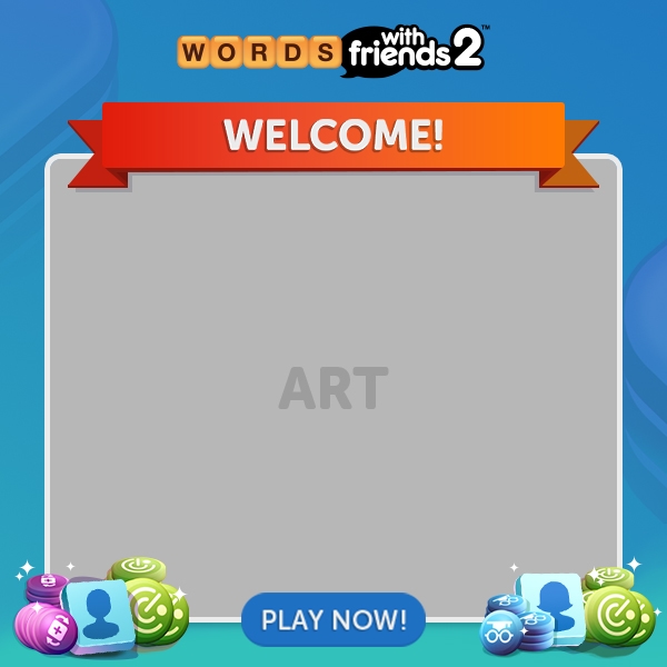
Words with Friends 2 templates
New Game Launches
Our team was one of the first to get involved in any new game launch, Marketing-wise. Working closely with the game teams, we devised useable launch toolkits with PSDs of early UI art, fonts, and decorations with which we would develop key art, templates, and pre-registration microsites. Key art was usually adapted for lifecycle marketing, communications art (for media), and even in-game as welcome or loading screens. As the UI art would round-out and mature and as branding solidified on the games, we would update templates and artwork created to reflect the present aesthetic.
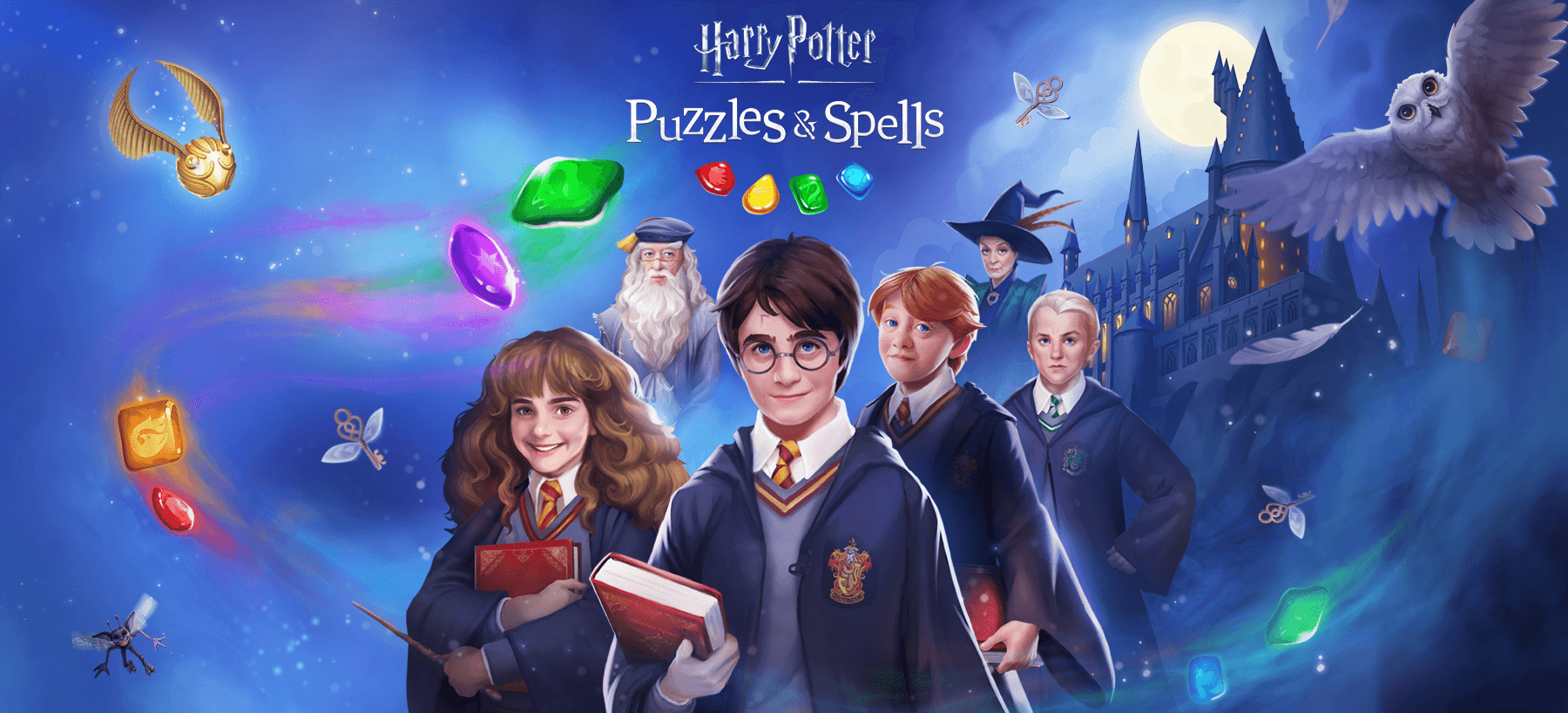
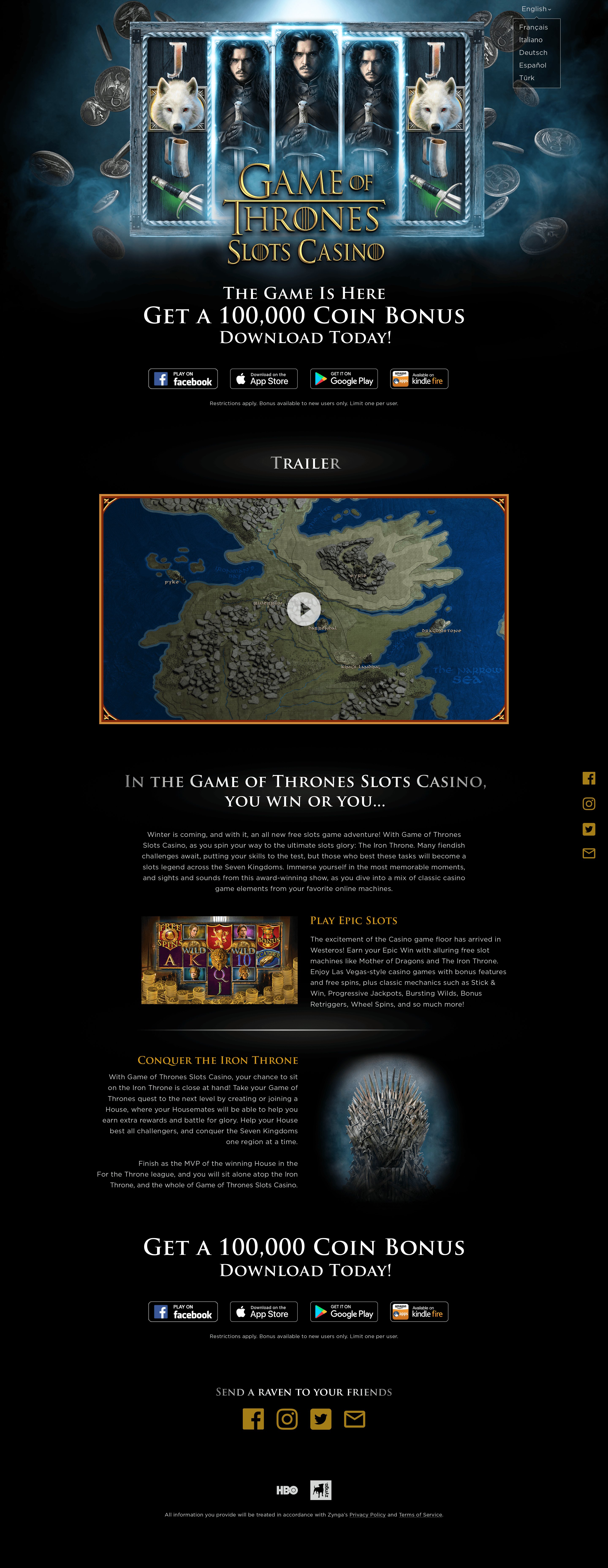
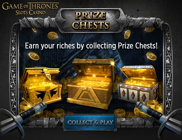
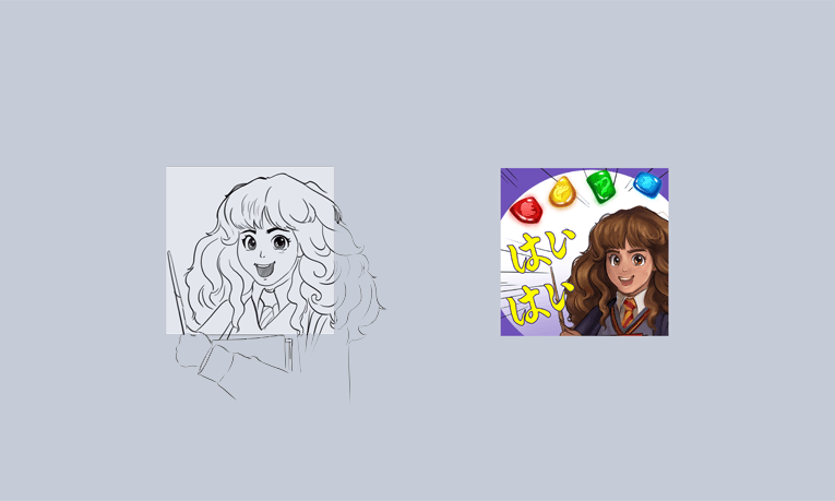
Aggressive launch marketing required having several emails, rich notifications (push notifications with images), and social posts ready everyday for the first 2-3 months of launch. Often times licensors even dictated a minimum amount of content for launch with alterations to that schedule only once the game was live. During these times we rerouted less important work to our outsource vendors and had in-house designers create the precedent for how the art should be handled. These were all-hands on deck operations with teams breaking out to handle large batches of work in short periods to receive timely licensor approval. We even took on specialized marketing requests like Harry Potter LINE stamps which tasked our concept artist with applying an anime flare to the game art so it was more appealing for Japanese audiences. Notable game launches I worked on include Game of Thrones Slots Casino and Harry Potter Puzzles & Spells.
Xpromo
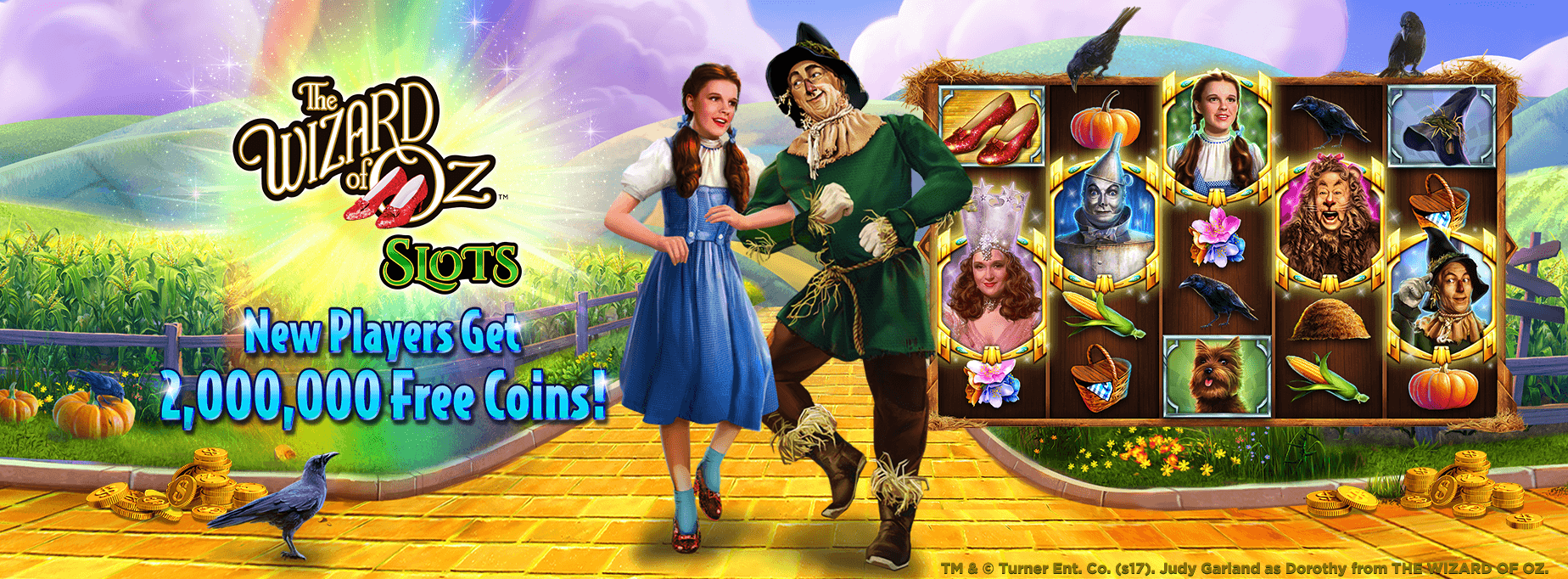
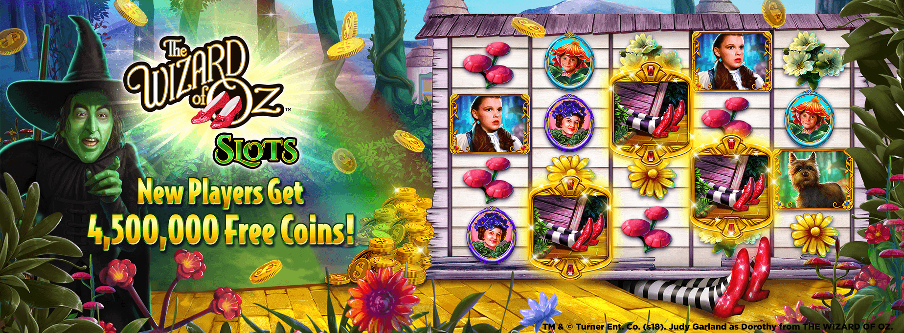
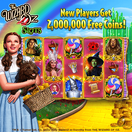
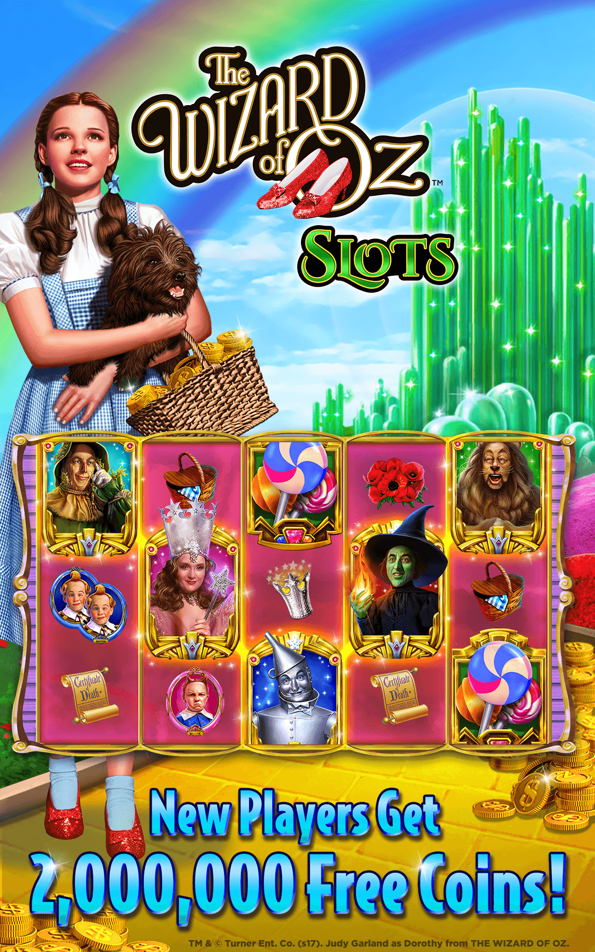
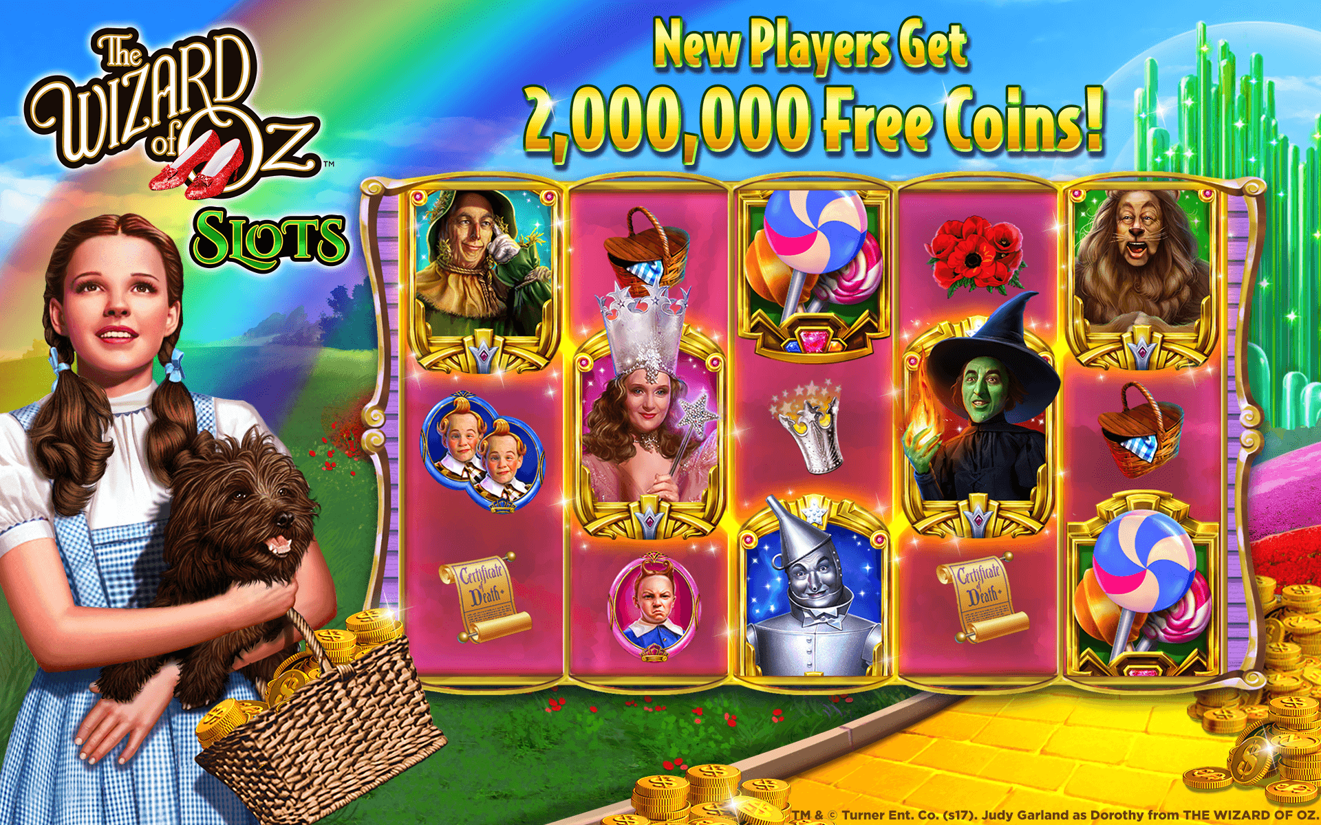
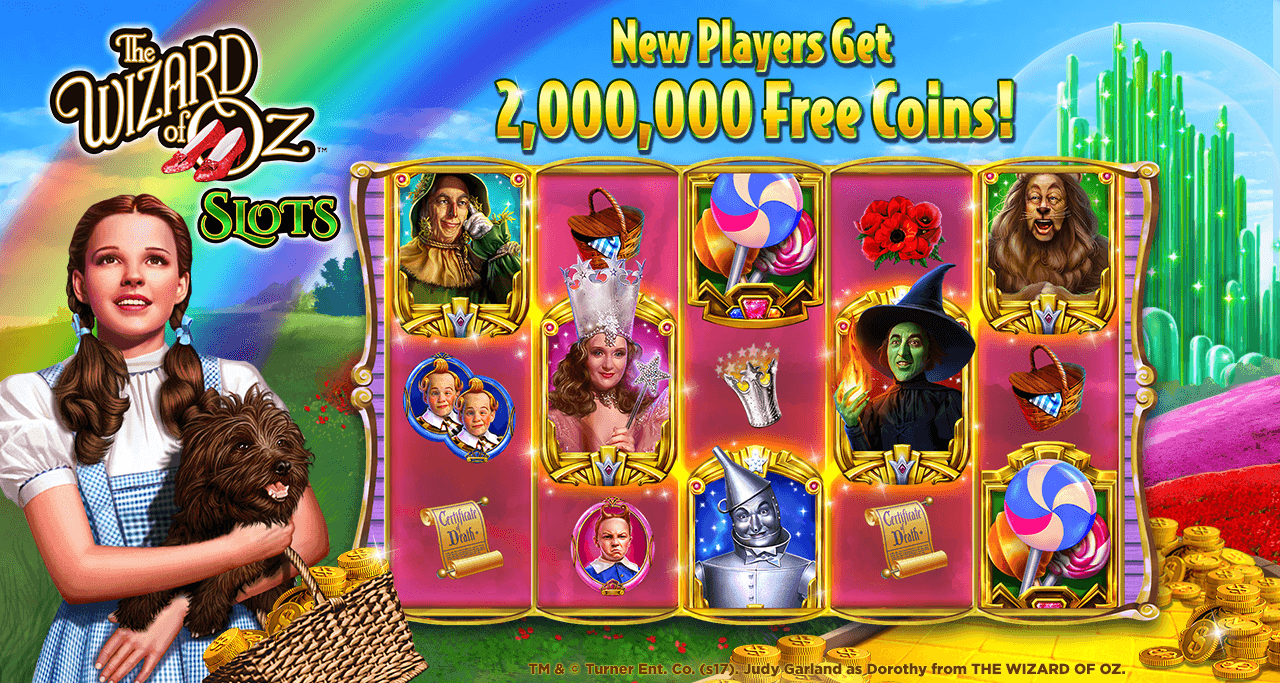
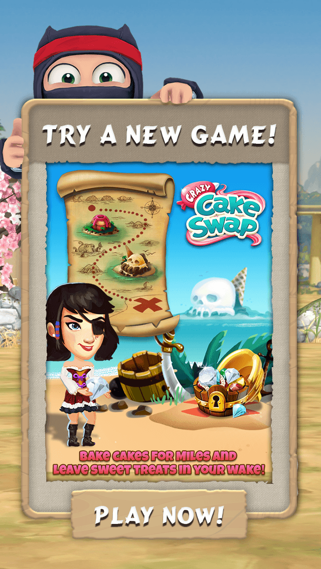
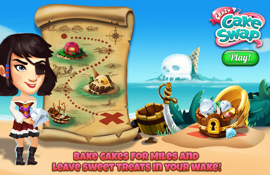
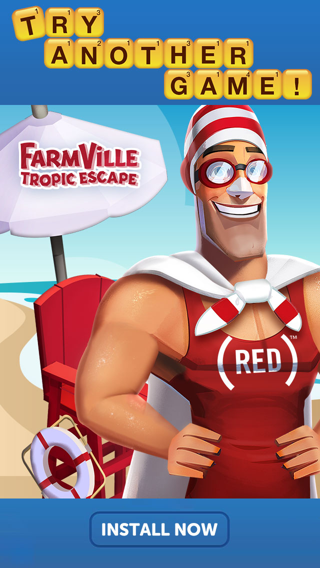
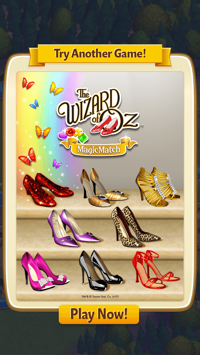
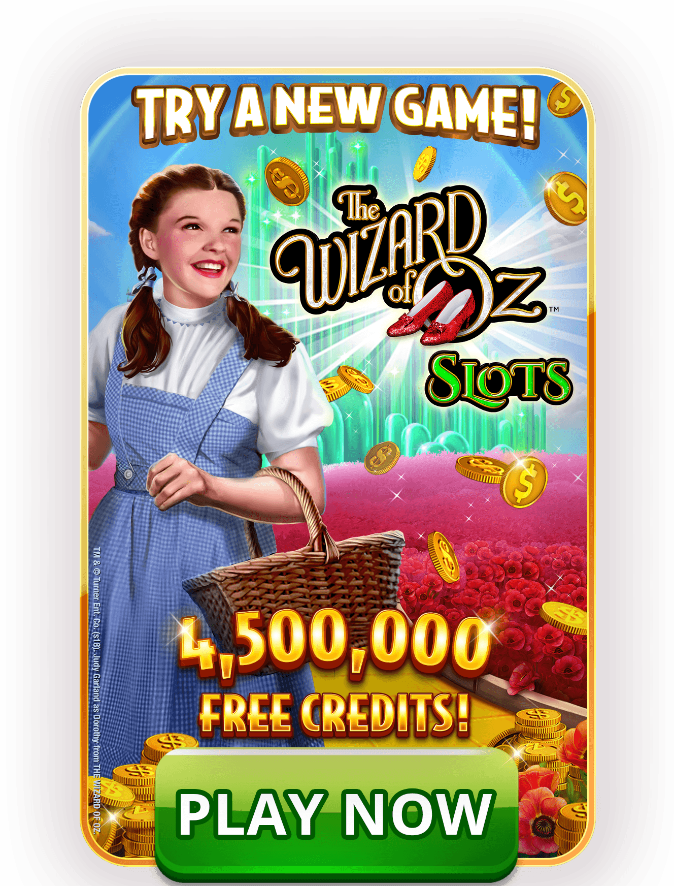
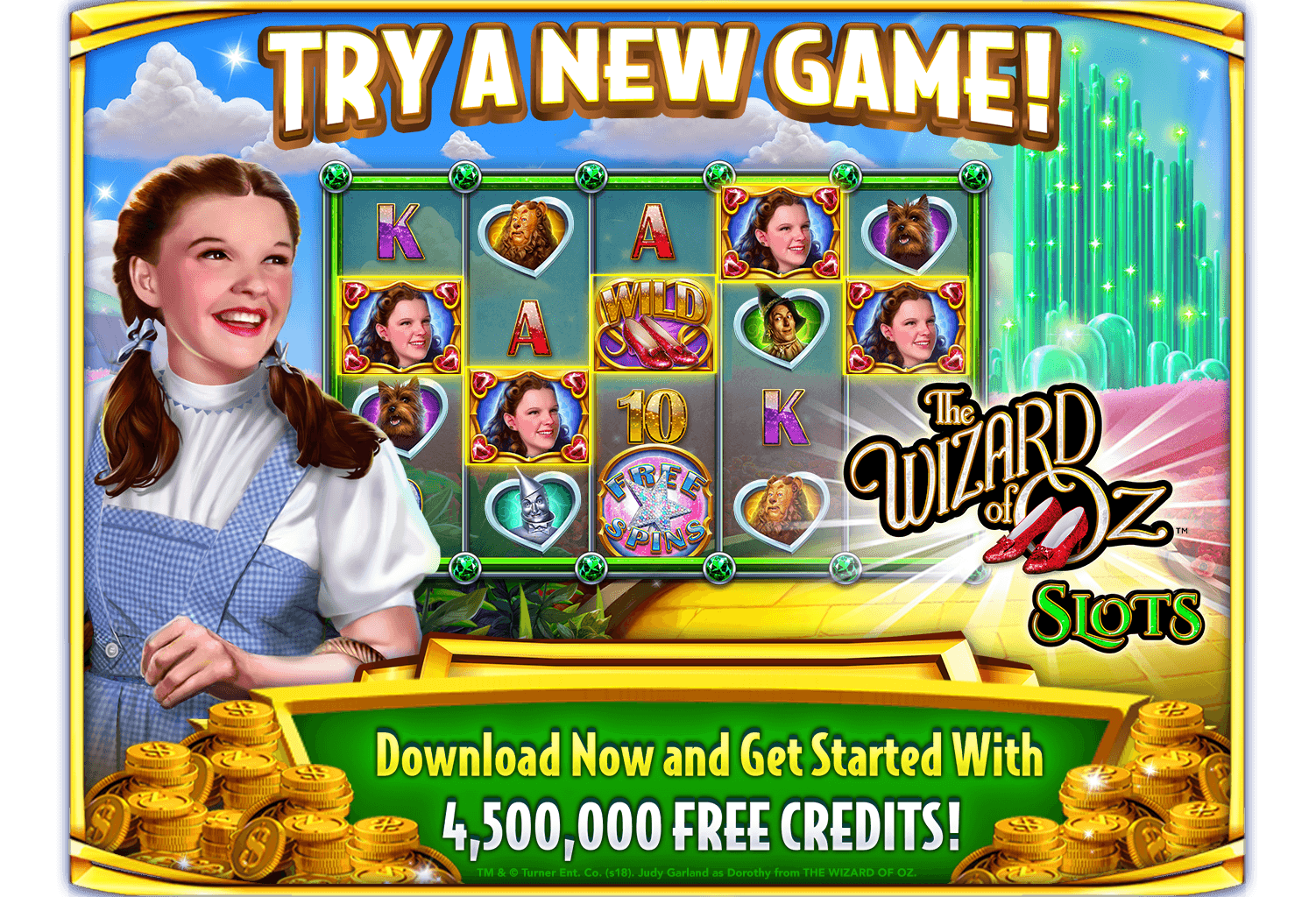
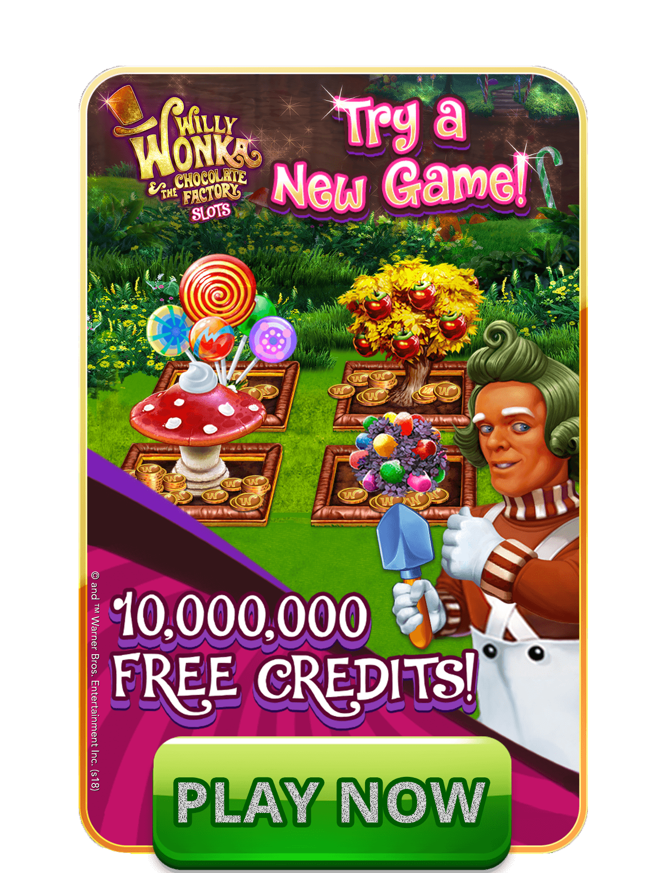
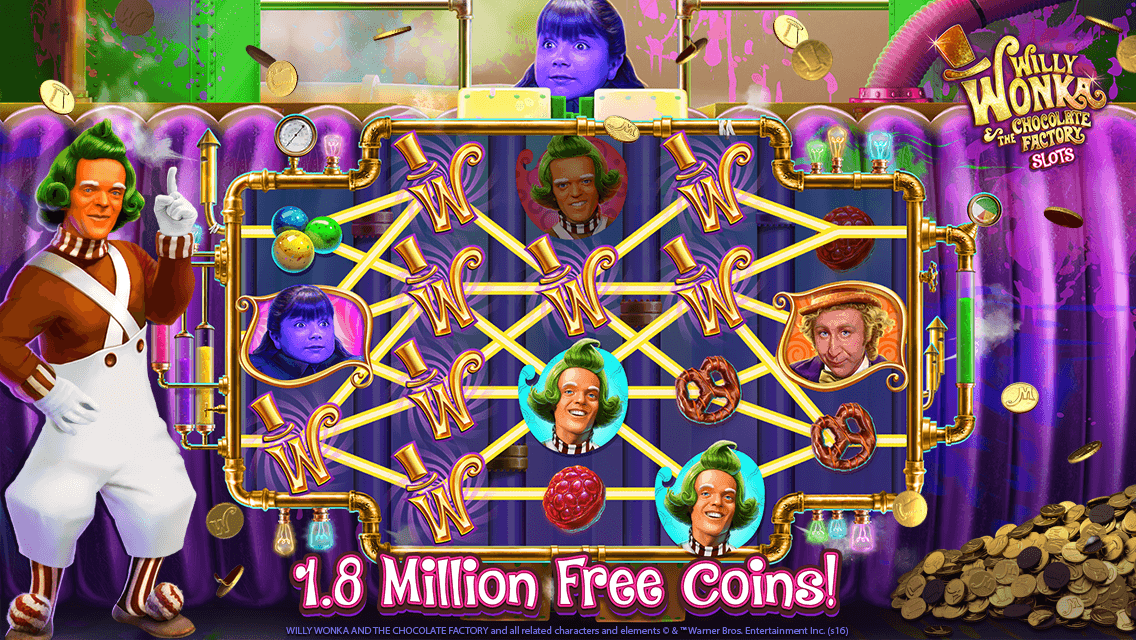
Xpromo, or Cross promo, ads would run in-game urging players to try a new game, usually with the promise of a large new player bonus. These ads consist of screen-sized as well as small HUD icons that were worked into the game UI. Because of the multiple locations these promos were ran, the deliverables equate to various sizes and outputs.
.246d736e.png&w=3840&q=100)
.214e19fc.png&w=3840&q=100)

Websites/Microsites
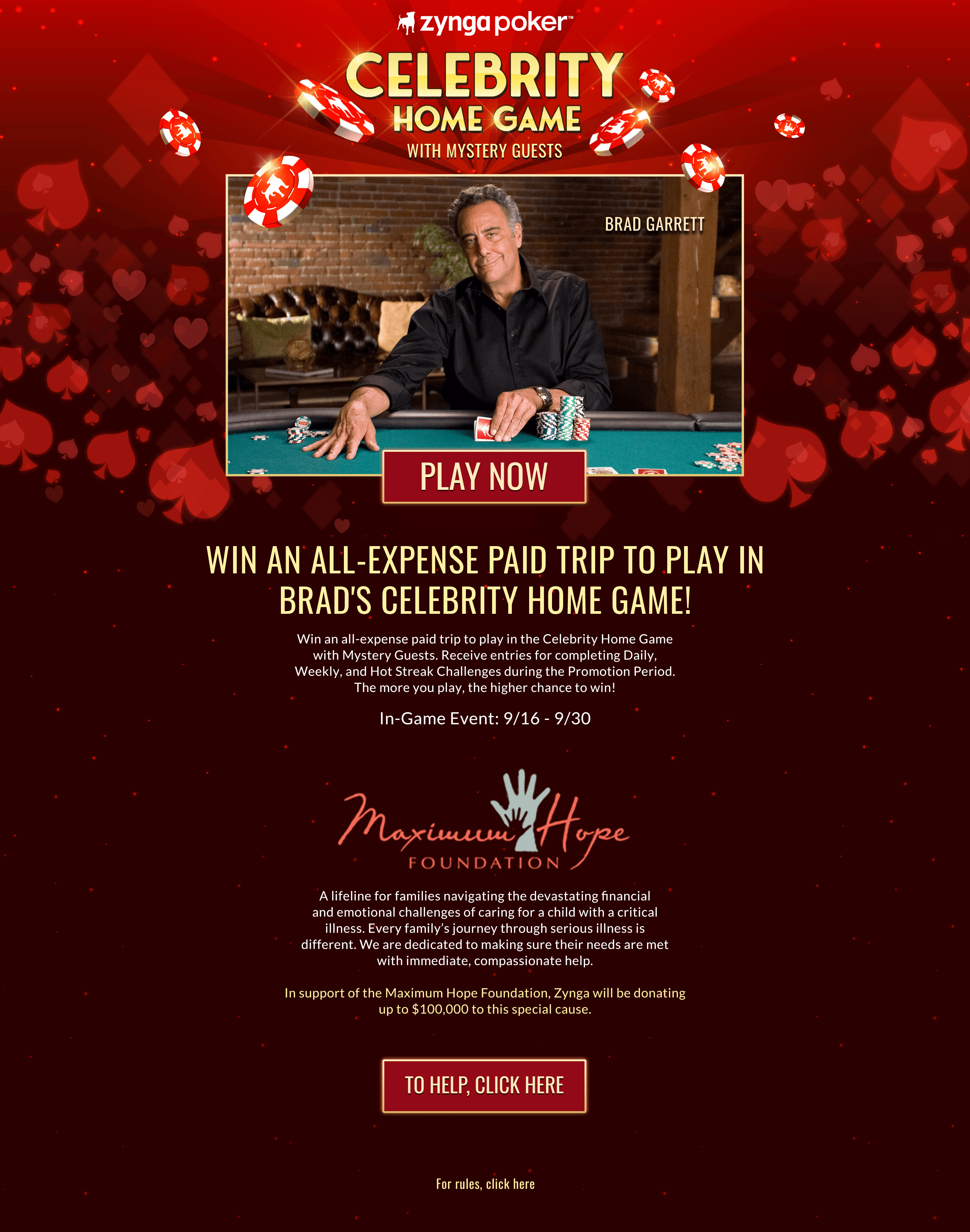
Often our team was tasked with creating small websites, or microsite, to promote limited time events, special releases, and pre-registration for new games. These sites packed a punch of information into single pages, including all necessary product links.
Other Random Request
Our team also took on random work requests for game team needs if our production schedule allowed for it. In this instance, I assisted the Words With Friends team with their monthly event logo because their regular artists were unavailable for a refresh.
